在CSS3中,我们可以使用animation-timing-function属性来定义动画的动画方式。所谓“动画方式”,指的是动画在过渡时间内的速率变化方式。
语法:
animation-timing-function: 取值; 说明:
animation-timing-function属性取值共有5种,这个跟CSS3过渡的 transition-timing-function是一样的,如下表所示。
| 属性值 | 说明 | 速率 |
|---|---|---|
| ease | 默认值,由快到慢,逐渐变慢 | 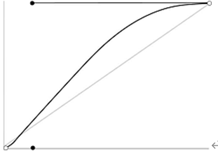 |
| linear | 匀速 | 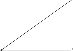 |
| ease-in | 速度越来越快(即渐显效果) |  |
| ease-out | 速度越来越慢(即渐隐效果) | 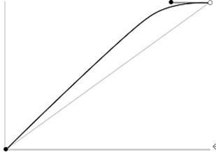 |
| ease-in-out | 先加速后减速(即渐显渐隐效果) | 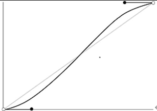 |
举例:
<!DOCTYPE html>
<html>
<head>
<meta charset="utf-8" />
<title></title>
<style type="text/css">
/*定义动画*/
@keyframes mytransform
{
0%{ }
100%{width:300px;}
}
div
{
width:100px;
height:50px;
line-height:50px;
text-align:center;
margin-top:10px;
border-radius:0;
background-color:lightskyblue;
/*调用动画*/
animation-name:mytransform;
animation-duration:5s;
}
#div1{animation-timing-function:linear;}
#div2{animation-timing-function:ease;}
#div3{animation-timing-function:ease-in;}
#div4{animation-timing-function:ease-out;}
#div5{animation-timing-function:ease-in-out}
</style>
</head>
<body>
<div id="div1">linear</div>
<div id="div2">ease</div>
<div id="div3">ease-in</div>
<div id="div4">ease-out</div>
<div id="div5">ease-in-out</div>
</body>
</html>
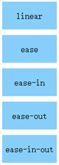
浏览器预览效果如下图所示。
分析:
通过这个例子,可以直观地比较出这5种动画方式的不同。在实际开发中,我们可以根据实际需求来选取哪一种。
