在CSS3中,我们可以使用animation-duration属性来定义动画的持续时间。
语法:
animation-duration: 时间;
说明:
animation-duration属性取值是一个时间,单位为秒(s),可以是小数。
举例:
<!DOCTYPE html>
<html>
<head>
<meta charset="utf-8" />
<title></title>
<style type="text/css">
@keyframes mytranslate
{
0%{}
100%{transform:translateX(160px);}
}
#container
{
display:inline-block;
width:200px;
border:1px solid silver;
}
#div1,#div2
{
width:40px;
height:40px;
margin-top:10px;
border-radius:20px;
background-color:red;
animation-name:mytranslate;
animation-timing-function:linear;
}
#div1{animation-duration:2s;}
#div2{animation-duration:4s;}
</style>
</head>
<body>
<div id="container">
<div id="div1"></div>
<div id="div2"></div>
</div>
</body>
</html>
浏览器预览效果如下图所示。
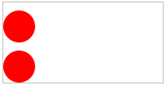
分析:
在这个例子中,我们定义第1个div元素的动画持续时间为2秒,而定义第2个元素的动画持续时间为4秒。这里顺便说一句,CSS3动画大多数时候都是配合CSS3变形一起使用,然后来实现各种绚丽复杂的动画效果。
